Virtual Impression: How to Reduce Web Page Bounce Rates
BY James Ambroff-Tahan

LISTEN
A website is only as effective as its ability to deliver leads. Reducing bounce rates is a vital step in building a productive website product.
When a law firm succeeds in drawing potential clients to its website, a key goal is achieved. But getting traffic to show up on a website’s doorstep is only half the marketing battle, because firms must also greet visitors with a website that has been optimized for conversion and sees relatively low bounce rates.
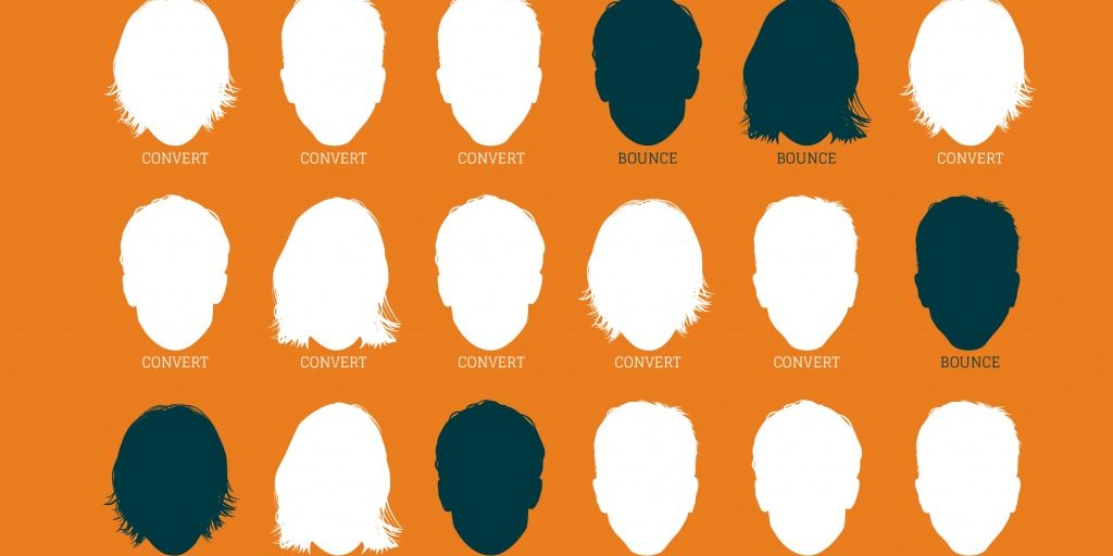
The term “bounce rate” refers to the measure of visitors who do not progress beyond the first page they open on a website. These short-term visitors “bounce” off a single page and visit no other.
Bounces are generally undesirable in an online-business-generation model — the longer a visitor lingers and peruses pages and content on a website, the more likely it is that the same visitor will move toward a conversion and actually contact the firm.
There are a number of steps that firms can take to reduce their bounce rates and, consequentially, enhance conversion rates.
In general, the strategy for accomplishing these parallel goals pivots on the presentation of as positive a first impression as possible. And for an attorney website to deliver that crucial first impression at its best, the site must be both aesthetically and technically approachable.
DESIGN FOR CONVERSION
Good design is the core aesthetic issue for a website. Looks really do matter, and an engaging design — with the proper balance of compelling text and attractive graphic elements — is more likely to provide the welcoming context a visitor needs to explore a website and convert into a new client.
Color, or more specifically, the contrast among colors, is one of the most effective, tried-and-true tools a site can use. Pages that employ too much white space or gray text can be dull to a visitor’s eyes. Before long, they could stray elsewhere. But the proper use of colors and patterns is pleasing to the eyes and directs a visitor to a page’s key points.
A well-designed website should include visual elements that will act as magnets, drawing visitors to the pitches the firm is making within its pages. Similarly, a well-designed website must avoid elements that repel visitors. A firm must strive to bring a visitor to its website and encourage the desire to explore it.
Do not not aggravate your guests with annoying pop-ups or distract them with automatic audio and
video content.
Develop proper presentation of your text elements. People have short attention spans and increasingly complex daily lives that include multiple time-consuming responsibilities and pursuits. Thus, shorter written postings are more likely to retain the attention of a reader, as are pieces that are judiciously segmented by the use of eye-catching, bold, black-type elements like subheads and lift quotes. Break long paragraphs into shorter, digestable bites and use typography strategically.
GET TECHNICAL
A visitor may find the design elements of a website alluring, but the attractive design loses its purpose if it creates technical issues that drive visitors from your site. And the top gateway technical issue for visitors is loading speed. Lags can send bounce rates skyrocketing. Once again, time is valuable. Visitors do not want to waste it on a boring, slow-loading web page.
A slow-loading website not only causes visitors to flee, but it is also a confirmed negative ranking factor.
Worse yet, a website that takes too long to load can destroy a firm’s conversion rate.
SPEED MATTERS
The value of speed in boosting a firm’s conversion rate can be quantified, and the numbers are dramatic. Findings from a 2013 study conducted by Intuit demonstrated that there is a 3 percent increase in conversions for every second reduced from 15 seconds to 7 seconds; a 2 percent increase in conversions for every second reduced from 7 seconds to 5 seconds; and a 1 percent increase in conversions for every second reduced from 4 seconds to 2 seconds.
Speed is king in the overall online realm, but you must also pay respect to accessability. The more accessible platforms a firm has, the larger the potential pool of followers it will draw.
In practical terms, that means a firm’s website should be accessible on mobile devices and tablets in clear and concise terms and offer a lush, complete experience on desktop computers.
USE INTUITIVE NAVIGATION
However a visitor accesses a firm’s website, it is important to make navigation easy to understand and prioritize during the visit. Foreboding side quests are best left to other realms — a firm’s website should be approachable, with linear and inviting navigation tools.
A well-designed website with easy-to-understand, approachable elements is part of an essentially simple formula to establish high conversion rates.
The power of useful visitor information to help a person make a business-generating decision cannot be underestimated: a recent survey showed that 66 percent of 1,200 respondents felt that a good website gives a business more credibility.
Unsurprisingly, consumers want to find practical information with ease on a firm’s website. While the most sought-after information concerns a price schedule a firm is not likely to provide, the next-most-desired items include such facts as a firm’s list of services, contact information and physical address. Along with informational features such as FAQs or supportive elements such as testimonials, these routine but practical details on a firm’s website help to bolster its credibility.
When creating an inviting site to lower bounce-rates, present useful information in an up-front manner against a pleasantly approachable design. Your welcoming guidance is at the core of the trust necessary to establish a business relationship. And that, fundamentally, is what conversion rates are all about.
LATEST STORIES


