How to Protect Your Brand Assets
BY Kristen Friend

LISTEN
Your firm’s brand assets are worthy of your attention (and protection).
Buzzwords are alive and well in the marketing industry, and branding is certainly a hot one. The term in its many forms is used so frequently that its true meaning is often lost. But the underlying truth of branding is real and important, no matter how annoying the word may have become.
Everything your firm does contributes to its brand. Your brand is your firm’s persona. It is the promise you make to clients as exemplified in visual elements, voice, copy and actions.
Understanding your brand and being able to communicate its value is important. All attorneys and staff should know how each of your brand elements supports your firm’s mission and objectives. People not affiliated with the firm should understand how to use your brand assets so that the brand is always presented consistently. Any designers who may work with your firm should be able to easily access the pieces of your brand so that they can continue to create a strong, uniform visual presence for your firm.
None of these objectives can be accomplished if your firm’s brand is a mishmash of poorly saved images, unknown fonts and randomly sampled colors. Brand elements deserve respect. Brand guidelines give them the respect they deserve. These guidelines explain your brand and illustrate how to (and not to) use its elements. Guidelines can be simple or complex but at a minimum should contain the following.
1. A statement of your purpose, mission and principles
2. Logo and logo usage
Your logo may consist of an image and text, or it may be text only. The logo usage portion of your guidelines will explain this. It should show all acceptable variations of the logo and in what situations each can be used. This includes outlining positioning, proportion, minimum size requirements and proper spacing around the logo. It may also show what not to do with the logo.
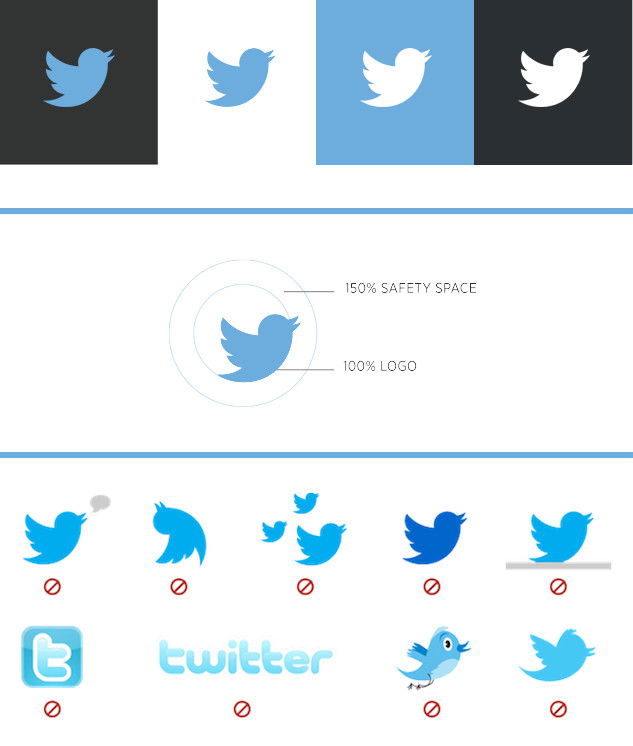
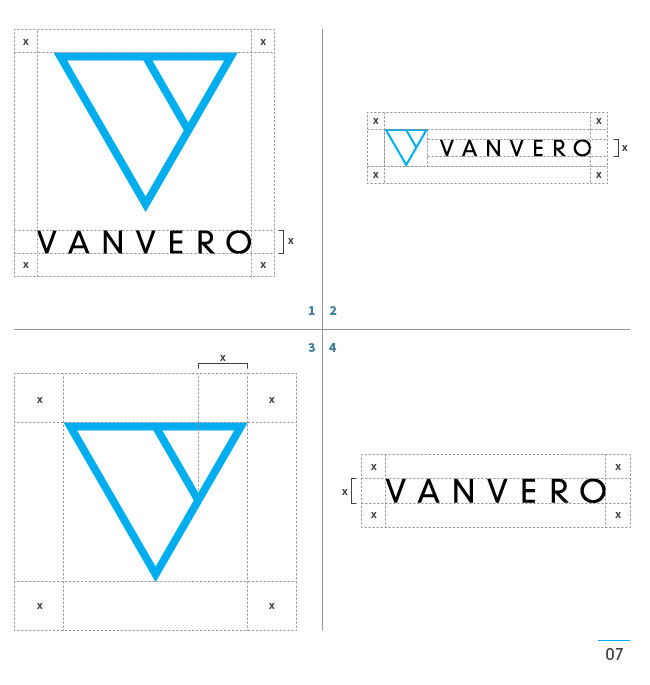
Remember to save your logos in a safe place. You should have an RGB (web), a CMYK (print) and a vector version of each variation. Failure to save your logos will result in a lot of poor quality reproductions and guesswork by designers.
3. Fonts and font usage
What font do you use in your logo? In what weight(s)? Do you have a font you use consistently in documents or presentations? (You should.) Fonts can evoke many feelings and emotions, and they must be used consistently to achieve a uniform look and feel. The fonts section if your brand guidelines will outline which font(s) you use, in what weights (bold, regular) and styles (italics, small caps), and it will describe proper spacing of letters (kerning). It should also manage the use of headlines, subheads and body copy for both print documents and webpages.
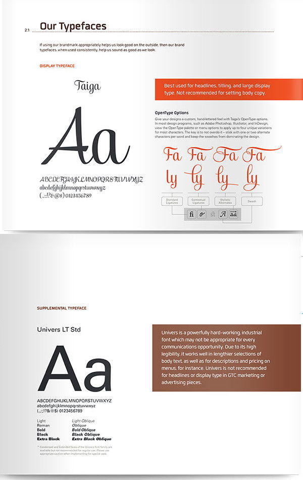
As with logos, be sure you have a copy of all your firm’s fonts saved in a safe place.
4. Colors
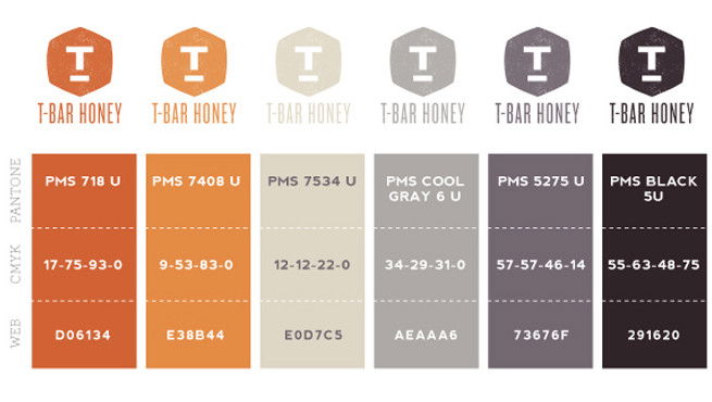
Establish primary and secondary colors and any complimentary colors your firm uses. Be specific about how and where each color can be used. For each, specify a hexadecimal code, RGB percentages, CMYK percentages, and Pantone Spot (PMS) numbers.
5. Imagery
You can use a style guide to manage the type of imagery that should be used in advertising materials. Things to consider include composition, tone, depth of field and subject matter. You can also describe how images may be used together.
Oregon State, The University of California and UCLA all have excellent online guidelines for photo usage.


6.Voice and style
Establish editorial guidelines to ensure that everyone at the firm is speaking with a consistent perspective and tone. Discuss rules for punctuation, capitalization, the use of italics, as well as use of first, second and third person. Establish an acceptable level of formality in tone. Outline which stylebook — the Chicago Manual of Style, the MLA Style Manual, the Associated Press Stylebook, etc. — people should consult should they have a grammatical question.
Your brand is important and should be treated as such. Make sure everyone is on the same page, with access to important assets like logos, colors and fonts. Only then will your brand achieve the consistency it deserves.
LATEST STORIES


